
Accessibility
UX Research
Interaction Design
Designing accessible phone calls for 63 million deaf users
A calling companion that lets Deaf and hard-of-hearing individuals make and receive phone calls independently without relying on a human interpreter.
Role
Research and Design
Platform
Android
Category
Academia
Year
2025

Why it mattered?
Hard-of-hearing users can't take part in a standard voice phone call. That cuts them off from delivery agents, customer support lines, and even calls from family and friends, every one of those interactions currently depends on either an interpreter or someone else picking up on their behalf.
Research reviewed for this project found that access depending on another person creates a real loss of agency for HoH individuals, and that this group is rarely treated as a direct stakeholder in service design, even though captioning and inclusive design measurably reduce stress (one cited survey found 70%+ of respondents felt more included when captioning was available).
63M+
Deaf individuals in India (2nd most common disability nationally)
430M+
Deaf individuals globally as per the most recent WHO census
2.5B
Projected globally affected by hearing loss by 2050
~17%
Of people who need hearing aids actually use them
THE Design process
How was the problem identified?
Rather than starting from an assumption, the process was built to work backward from evidence. Data collection fed into interpretation across six lenses: behavioural, emotional, cognitive, cultural, social, and contextual. That interpretation ran through grounded theory instead of a straight line from data to conclusion, patterns found during mapping kept sending the research back to collect more data, refining the clusters each time the loop repeated.
Research surfaced three recurring clusters across the space. Reliance, where performing a task required another person; Inclusion, where being present did not mean participating; and Awareness, where the world communicates through sound with almost no visual backup.

data collection
Research Methodology
Secondary research was the primary medium of data collection given the constraint of availability of real participants, with 7 case-study videos, 5 academic papers, 1 documentary (Deaf President Now), and the WHO's 272-page World Hearing Report as the source.
Note
This was desk research, not primary interviews with Deaf participants.
stats figured
Findings
Everyday task difficulty broke down as: 24.8% transportation, 24.3% activities outside the home, 22.5% things around the home, 16% managing health, 7.2% shopping/finances, 5% basic daily activities
Current adaptation methods: 36.3% rely on their own workarounds, 27.3% get help from family/outsiders, 26.7% use existing devices or tools
Only ~17% of people needing hearing aids use them; sign language users tend to think in visual blocks rather than linear text; people switch between communication modalities depending on context
In their own words…
Drawn from an interview study of 60 Deaf adults, describing the same exclusion this project set out to solve.
“I’d show the food image on the phone and then they would order”
“and they kind of stay away and withhold their communication”
“I just kind of sit there [with family and friends] and be quiet. I do not feel involved”
“the instructor is shouting out instructions, I have to follow people who are next to me”
“I keep checking the video phone to see if I missed a call”
“they would throw stones at my window so I get to know about my child crying”
Shende, Shraddha & Koon, Lyndsie & Singleton, Jenny & Rogers, Wendy. (2025). Everyday Challenges and Solutions for Individuals Aging With Deafness.
tools used
Primary artifacts
Content analysis (Excel)
The 37 tasks from the base research were logged and coded on frequency, assistance-required, and tech-availability, producing the task-difficulty percentages.
Affinity mapping
Those coded findings were clustered into themes across the six lenses (behavioural, contextual, emotional, cognitive, cultural, social).
Pain vs. frequency matrix
The clustered themes were then plotted on this 2×2 to surface the highest-priority opportunity: calling.
Note
The pain vs. frequency matrix made the core problem obvious, and the final problem statement was derived directly from it.
Since
HoH users cannot participate in traditional phone calls due to inability to hear or speak, making essential services (delivery agents, customer support, family/friends) inaccessible.
A calling companion for hard-of-hearing individuals to make and receive phone calls independently making every call accessible, independent, and effortless.
No. 1
Receive unknown calls
The user will always know who's calling and why, before deciding whether to pick up.
No. 2
Make outgoing calls
The user can place a call and carry the entire conversation independently.
No. 3
Engage in a voice call using typing
The user can hold a full two-way conversation entirely by typing.
No. 4
Use customer service IVR/DTMF
The user can navigate an automated phone menu on their own.
No. 5
Know state of the phone call
The user always knows whether it's ringing, connected, on hold, or waiting to resume.
No. 6
Prevent spam calls
The user is protected from spam and irrelevant calls before dealing with them.
the concept
How it works?
Think of it like a helper standing between the user and the caller. When the caller talks, the helper writes down everything they say so the user can read it. When the user types a reply, the helper reads it out loud so the caller can hear it. This keeps happening back and forth for the whole call. The helper also does two more things: before the user even picks up, it checks who's calling and why, so there are no surprises. And while the call is happening, it always tells the user what's going on, like if the call is on hold, or if it's just a robot menu talking.
To make this helper real, four tools work together behind the scenes. Twilio is what actually makes and receives the phone call. ElevenLabs is the part that reads the user's typed words out loud to the caller. Google Cloud Speech API is the part that listens to the caller and turns their words into text. And every call gets saved, what was said, a recording, and a short summary, so nothing gets lost.
still The concept
Understand it with a storyboard
Here's what it actually looks like for the user, across a real call, from an unexpected number ringing in to a full conversation carried out through typing and text.

Arav, a HoH receives call from an unknown number and is not sure about who it is or what it is for.

He decides to click on AI scan which responded with “Hi, this is Arav’s agent. What is the purpose of calling?”

As the AI talks with the unknown caller, the caller replies back with, “I’m here for the delivery of the parcel”

Arav sees the transcription and also the intent, “Delivery agent”. He picks up the call. And AI replies with, “Aarav is now on the call, you may speak please.”

The delivery agent replies with, “I’m downstairs at your building”

Aarav sees the transcription and now aware of what the other person is saying.
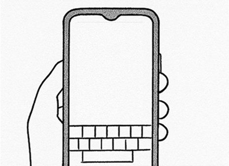
He starts typing that he’ll be there is a minutes and the same is announced to the caller.

The caller hears the TTS voice and says “Okay I’m waiting.”
THE CONTEXT
Why it mattered?
I’m Shreyansh, a UX Designer who has worked inside startups, built one myself, and collaborated across product, engineering, and business teams to ship real products.
I’m Shreyansh, a UX Designer who has worked inside startups, built one myself, and collaborated across product, engineering, and business teams to ship real products.
First time users are prompted to add a card for faster repeat payments.
First time users are prompted to add a card for faster repeat payments.
First time users are prompted to add a card for faster repeat payments.
The Outcome
Why it mattered?
I’m Shreyansh, a UX Designer who has worked inside startups, built one myself, and collaborated across product, engineering, and business teams to ship real products.
I’m Shreyansh, a UX Designer who has worked inside startups, built one myself, and collaborated across product, engineering, and business teams to ship real products.
12%
Research and Design
The redesigned checkout was first rolled out across 100 societies before a wider launch.
12%
Research and Design
The redesigned checkout was first rolled out across 100 societies before a wider launch.
12%
Research and Design
The redesigned checkout was first rolled out across 100 societies before a wider launch.
Reflections & Learnings (My 2 cents)
I’m Shreyansh, a UX Designer who has worked inside startups, built one myself, and collaborated across product, engineering, and business teams to ship real products.
I’m Shreyansh, a UX Designer who has worked inside startups, built one myself, and collaborated across product, engineering, and business teams to ship real products.
I’m Shreyansh, a UX Designer who has worked inside startups, built one myself, and collaborated across product, engineering, and business teams to ship real products.
Let’s do
incredible
work together!
Copy component
Copied
hi@shreyanshk.com

© 2026 Shreyansh.
All rights reserved