BACK
Most Finance Apps End Up Rotting in Your Phone’s Storage
Designing a personal finance app for students who already know they're bad with money
uX design
ui design
visual identity
What I Did
01.
Quantitative survey across 65 day scholar respondents covering spending habits, tracking behaviours, and abandonment patterns
02.
9 semi-structured interviews and 1 focus group to understand the mental models students actually use around money
03.
Affinity clustering across all data to surface three structural problems no existing app was solving
04.
Full visual identity, information architecture, and high-fidelity UI for a student finance app built from first principles in Figma
05.
SUS evaluation across usability testing participants, with qualitative follow-up to surface four specific design fixes
Overview
I'd been tracking my spending in an Excel sheet for years. Adding rows, filling categories, being diligent about it every month. And every time I tried to find a proper app to replace it, something felt off. Too many screens. Too much jargon. Features I'd never touch. So I'd close the app and go back to my spreadsheet.
That frustration became a design project. The personal finance app market is valued at $101 billion and growing. 60% of people already use some form of digital finance management. This wasn't a neglected space. People were using these tools. Something else was going wrong, and I suspected it had less to do with bad interfaces and more to do with apps built around the wrong mental model entirely.
Outcome
65
Survey respondents across spending and tracking habits
3
Structural problems identified
40%
Student spending flows through cash, making it invisible to automated systems
86
SUS score, placing the final design in the "Excellent" usability range
01.
The Assumption I Started With, And Why It Broke
The approach
My initial problem statement was confident: personal finance apps have non-intuitive interfaces and too much jargon, creating a high entry barrier for young users. I believed it completely. I'd felt it myself. But I'd also just described my own experience and projected it onto everyone else. The research had to confirm that or break it.
I focused on day scholars aged 18 to 25: irregular income, spending split across cash and UPI constantly, managing whatever's left after tuition and rent. Before collecting a single data point, I listed my assumptions explicitly: students want to track but face friction doing it, cash is a significant part of their spending, they abandon apps after trying them, and their patterns are impulse-driven. Some held. Some didn't. The interesting findings were always in the ones that cracked.
02.
What 65 Surveys and 9 Interviews Actually Showed
The Research
The quantitative phase was a 65-response survey covering spending and tracking habits, 15 questions in MCQ and MSQ format, averaging 2 minutes to complete. 40% of respondents said cash accounts for more than half their total spending. 54% couldn't recall where they'd spent their money. 57% were already budgeting in some form. And 81% said their current method doesn't work. The majority were already trying. It still wasn't working. That shifted the question from "why don't students track?" to "why does tracking keep failing them?"
Nine interviews and a 5-person focus group went deeper. Average interview was 16 minutes, across four departments, average age 20. What surfaced wasn't friction with interfaces. It was a mismatch in mental models. Students don't think about money in categories. They think in incidents: "I went to Paltan Market on Sunday." "We went out after the exam." Spending tied to places, people, and situations. Cash was its own gap: flowing in from family and ATM withdrawals, vanishing the moment it left your pocket. And the most important insight was the simplest: checking bank balance was how students decided whether they were on budget. Not reports. Not category totals. Just: do I have enough left?
03.
Problems Every Finance App Is Ignoring
THE FINDING AND THE DESIGN
Affinity clustering across all data collapsed into three structural problems. The Invisible Cash Problem: 40% of student spending is in cash, logged nowhere, recalled only roughly. The Repetition Tax: students have predictable spending, the same auto fare every morning, the same lunch service every week, but every app treats every transaction as a new manual input event. The Transaction vs. Expense Distinction: an ATM withdrawal isn't an expense, but most apps flag everything identically, forcing students to fight with categories until the whole system feels pointless and gets abandoned.
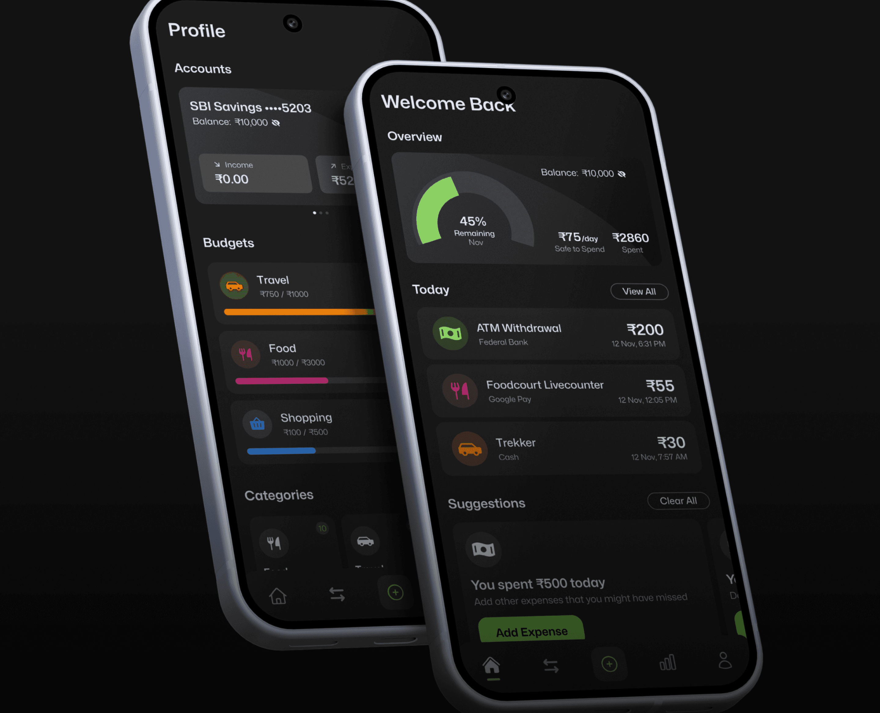
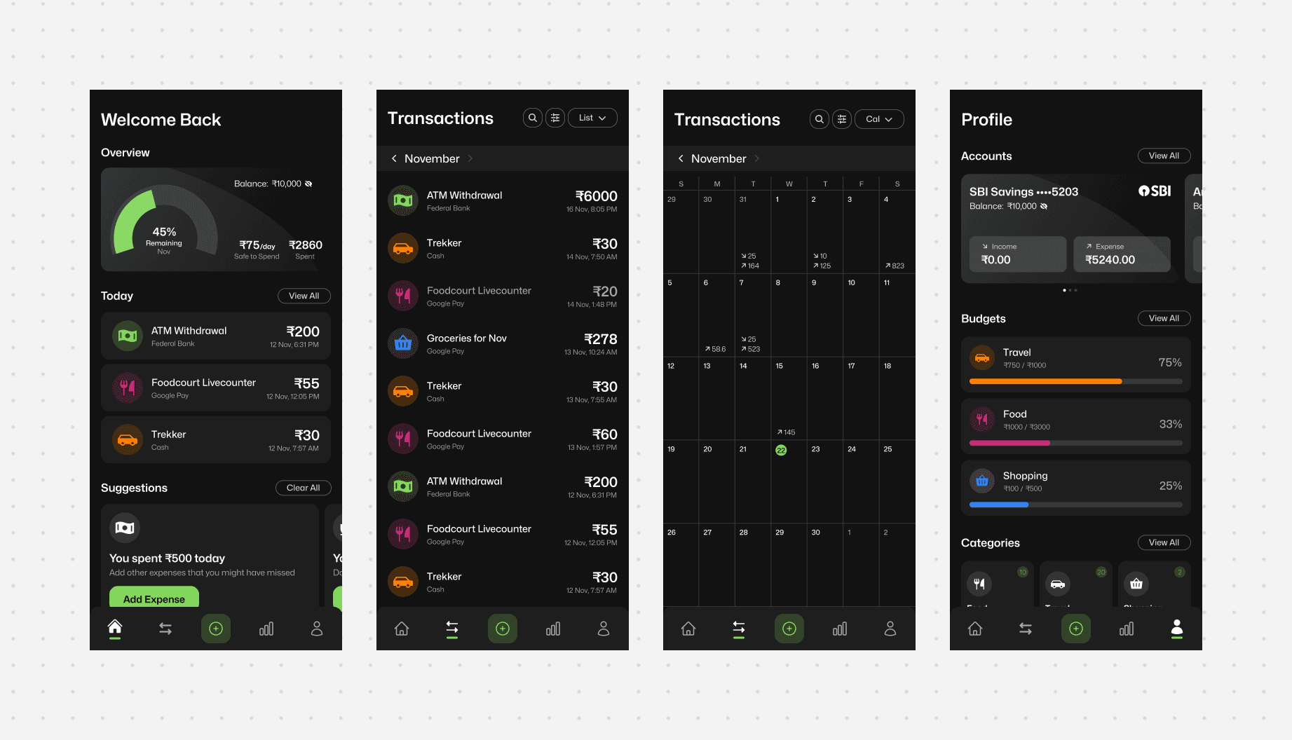
The app I designed around these three problems is called Wavelet. The home screen surfaces bank balance privately, hidden by default, revealed with a biometric tap, because that's already how students check whether they're okay. A "Safe to Spend" reading sits below it: based on remaining budget and days left, here's what you can spend today. A Quick Question screen during onboarding asks how much cash is in your wallet right now, seeding the one number no automated system can capture. The Add Expense screen replaces "Add" and "Cancel" with "Add Expense" and "Save and Add Another," removing the friction of reopening the form for students logging five transactions at 10pm. Templates handle the repetition tax. A "Mark as Expense" toggle handles the transaction distinction. And a location-aware suggestion system notices patterns: if you pass the same petrol station every Thursday and nothing's logged, the app asks. Not "don't forget to log." More like: you went somewhere. What happened?
04.
Testing Didn't Validate the Design. It Improved It.
the Result
SUS evaluation returned a score of 86 out of 100, placing the design in the "Excellent" range. But the qualitative follow-up was where the real learning sat. Four specific issues surfaced: a custom cash icon in the navigation wasn't understood, so it was replaced with the payment exchange icon already familiar from PhonePe and Paytm. The calendar view in Transactions was completely undiscoverable, resolved with a blinking green dot on the toggle as a signifier. A Transfer feature was confusing and unused, removed entirely since the Mark as Expense toggle already handled the need. And Templates weren't understood on first use, so a tooltip now surfaces on the second or third open rather than the first.
The one thing the testing couldn't resolve: the suggestion system. The concept is sound but depends on location data I couldn't prototype realistically. The edge cases, the false positives, the accuracy over time, that needs real-world testing the scope of this project didn't allow for.